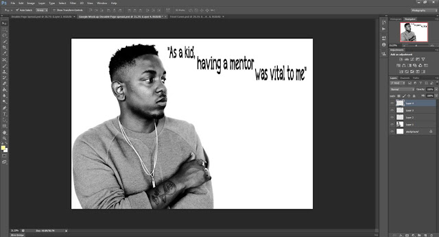
I decided to go with this picture of Kendrick Lamar as he fills one half of the page which is conventional of a double page spread and the image was already black and white which fits with the rest of the style of my magazine. I also picked it because I like the pose he was doing and how when I add the text it will look like he is looking at it.
I then added a pull quote that will be included in the text. I did this as it is very conventional of a double page spread and wanted to follow that convention. I decided on this layout as it fills the page nicely. I got this text from www.dafont.com as they have a variety of fonts to choose from.
I then changed the font colour to the same colour that was on my front cover so that it fit with my chosen colourscheme and create a housestyle throughout the magazine.
I then added in my article in sections so that it would go around Kendrick Lamar and none of the article would be covered up. Doing this also created a nice layout which is appealing to look at.


No comments:
Post a Comment