This was the original image of Kendrick Lamar that I found. I decided to use this image because it is a medium- close up which is very conventional to use on a magazine front cover. It also has space around both sides of it which will allow me to add feature stories to both sides.
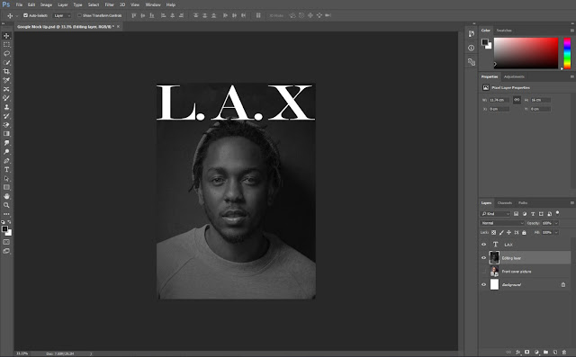
I then changed the image to make it black and white. I did this because it means that I can add colour with the text instead which will make my magazine stand out against others. Also I prefer the picture in black and white and think it will be more eye-catching since black and white pictures on a magazine are less common.
I then added in the name of my magazine. I decided to make this white since the picture is dark and the name will stand out against it creating a strong contrast. It also means the name will be seen from a distance as it is also quite big.
Next I moved the image down slightly and created more of the background at the top. I did this because I didn't like how much the title was on his head and wanted it to be more in a space of its own. I like it more like this now since the main image isn't being covered up.
To add more to the magazine more conventional I added a footer as a header wouldn't have looked right with where the title is. I decided to make the magazine a special collectors issue because of research I had done into rap magazine front covers. I also decided to make it quite a dark blue but turn down the opacity so it wasn't as prominent compared to the main image and title.
I then added in my main feature story as to make sure my magazine follows the convention of a magazine. I also decided to make the story about the Youth since Kendrick Lamar is involved with the future the youth have. This story has also been put in blue so that it fits with my house style.
Next I added in a barcode and a plug to further follow conventions of a magazine. I decided to make the plug a free CD because of my research into what a rap magazine would look like. I placed both of these to the side of the magazine so it didn't really touch the image and it didn't take up too much space which I would need for my feature stories.
Then down the left hand side I added the names of rappers that would feature inside in some way. I did this because a lot of rap magazines add names of rappers to bring in more of an audience and to give the reader a quick overview of who will appear in the magazine.
I then added in two feature stories down the right hand side of the page. I made sure that the feature stories were to the side and didn't touch the main image but instead filled all of the space around it. I did this because it is very conventional. I also made sure that the feature stories were in different fonts and sizes to further conform to conventions.
I then added the number of the issue under the title at the left since there was a little bit of space left. I also added the number because it is conventional of a rap magazine which I wanted to follow as it meant my magazine was not only conventional but also conventional to the genre.
This is my finished google mock-up which I like since it follows conventions and has a nice colour scheme to look at and see on a stand. However after speaking with Becky I decided to make a few more changes to the front cover so that it would make more of an impact on my target audience.
To make the main story stand out more against my front cover compared to everything else on it. I changed the colour of it all to white. Another reason I changed it white is that I needed more white on my magazine since white was a part of my colour scheme and didn't appear much on my magazine.
I then changed the names of my feature stories to white to make it more clear that they were the titles and not a part of the feature story itself. Doing this also added more white to my magazine which made it fit more with my chosen house style.
To then finish off my Google Mock-up front cover I changed the shape of the plug so that it would be bigger on the page meaning that it would draw more of an attention and bring a bigger audience. I also added that it was a Kendrick Lamar CD as it would make more sense to have the main artist featured to be giving away a free CD.


